Tailwind Css Border Gradient
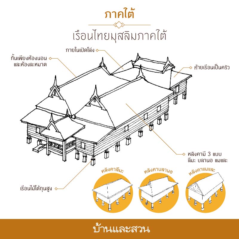
059+1111+540927_c+บ้านเรือนไทยภาคเหนือ ภาคใต้ ภาคอีสาน+artp6+dltv54. 059+1111+540927_c+บ้านเรือนไทยภาคเหนือ ภาคใต้ ภาคอีสาน+artp6+dltv54 ...
Gradient borders have quietly become one of the most distinctive flourishes in modern interface design, lending depth and polish to cards, buttons and callout panels without overwhelming the underlying layout. Tailwind CSS does not ship a dedicated border-gradient utility out of the box, yet its utility-first architecture makes the effect remarkably straightforward to achieve through a handful of well-established CSS techniques. This guide examines the most reliable approaches, along with the practical trade-offs development teams should weigh before adopting them in production.
Why Gradient Borders Earn Their Place in a Design System
A well-executed gradient border draws the eye toward high-value content, signals interactivity, and introduces a sense of depth that flat outlines struggle to match. Marketing teams frequently favour them for premium subscription cards and promotional banners, while product designers use subtle two-tone borders to distinguish states such as "featured" or "selected". Because Tailwind encourages composable, token-driven styling, gradient borders can be expressed as reusable components, ensuring that colour stops, border radii and spacing remain consistent across an entire application rather than being reinvented on every screen.
Technique One: The Background-Clip Method
The most elegant solution relies on two CSS properties working in tandem: background-clip and a transparent border. By layering a solid padding-box background over a gradient border-box background, the gradient is visible only along the element's edge, producing a crisp outline that respects any border radius you apply. The underlying CSS looks like this:
.gradient-border
  border: 3px solid transparent;
  border-radius: 12px;
  background:
    linear-gradient(#ffffff, #ffffff) padding-box,
    linear-gradient(to right, #38bdf8, #a855f7) border-box;
In Tailwind, this can be expressed inline using arbitrary properties, keeping the styling colocated with your markup. While the resulting class string is admittedly verbose, it removes the need for a separate stylesheet and behaves predictably with utilities such as rounded-xl. For anything reused across multiple views, extracting the pattern into a dedicated component is strongly recommended.
Technique Two: The Nested Wrapper Approach
Where maximum browser support is a priority, the nested wrapper remains the dependable fallback. An outer element receives the gradient background along with a small uniform padding, while the inner element sits on a solid background with a slightly larger radius. The visual result is indistinguishable from a true gradient border:
<div class="p-[3px] rounded-xl bg-gradient-to-r from-sky-400 to-purple-500">
  <div class="rounded-[9px] bg-white p-6">
    <!-- Card content -->
  </div>
</div>
This technique works in every browser that supports gradients, requires no exotic properties, and pairs naturally with group-hover and transition utilities for animated hover states. Its main drawbacks are the additional DOM node and the need to calculate inner radii manually, though both are trivial to manage within a component abstraction.
Animation, Performance and Accessibility Considerations
Rotating conic gradients can be animated using the CSS @property rule to register a custom angle, creating a subtle shimmering effect on featured cards. Browsers that lack @property support simply render a static border, which constitutes graceful degradation rather than breakage. When animating, respect the motion-reduce variant so users with vestibular sensitivities are not affected, and confirm that text inside gradient-bordered elements maintains a contrast ratio of at least 4.5:1 against its background. Avoid animating large surface areas continuously; a gentle transition on hover is typically sufficient to convey interactivity.
Codifying the Pattern for Team-Wide Consistency
Once a preferred technique has been selected, document it and encapsulate it. Whether you build a thin React component, a Blade partial, or register a custom .border-gradient utility through Tailwind's plugin API, centralising the implementation ensures colour tokens and radii remain consistent as the codebase grows. Treated this way, gradient borders stop being a one-off flourish and become a durable, maintainable part of your design language.
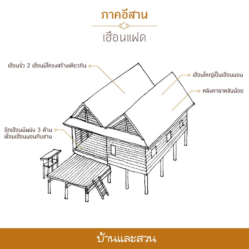
บ้านไทย รู้จักเอกลักษณ์ เรือนไทย 4 ภาค ภาคเหนือ ภาคกลาง อีสาน ใต้
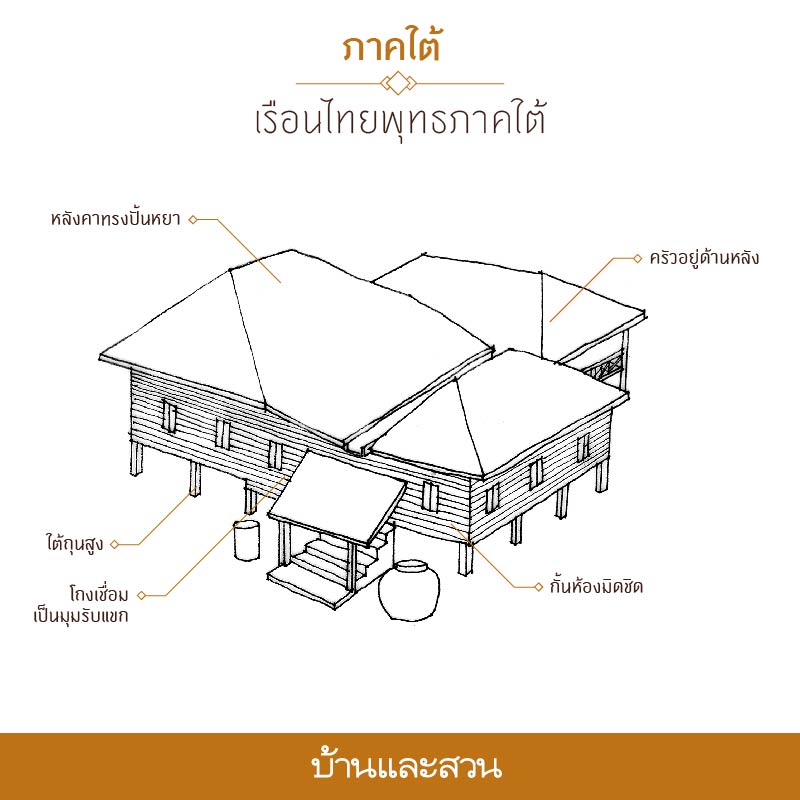
บ้านไทย รู้จักเอกลักษณ์ เรือนไทย 4 ภาค ภาคเหนือ ภาคกลาง อีสาน ใต้ ...
059+1111+540927_C+บ้านเรือนไทยภาคเหนือ ภาคใต้ ภาคอีสาน+artp6+dltv54

059+1111+540927_C+บ้านเรือนไทยภาคเหนือ ภาคใต้ ภาคอีสาน+artp6+dltv54 ...
รู้จักเอกลักษณ์ บ้านไทยพื้นถิ่น 4 ภาค เหนือ/กลาง/อีสาน/ใต้ - บ้านและสวน
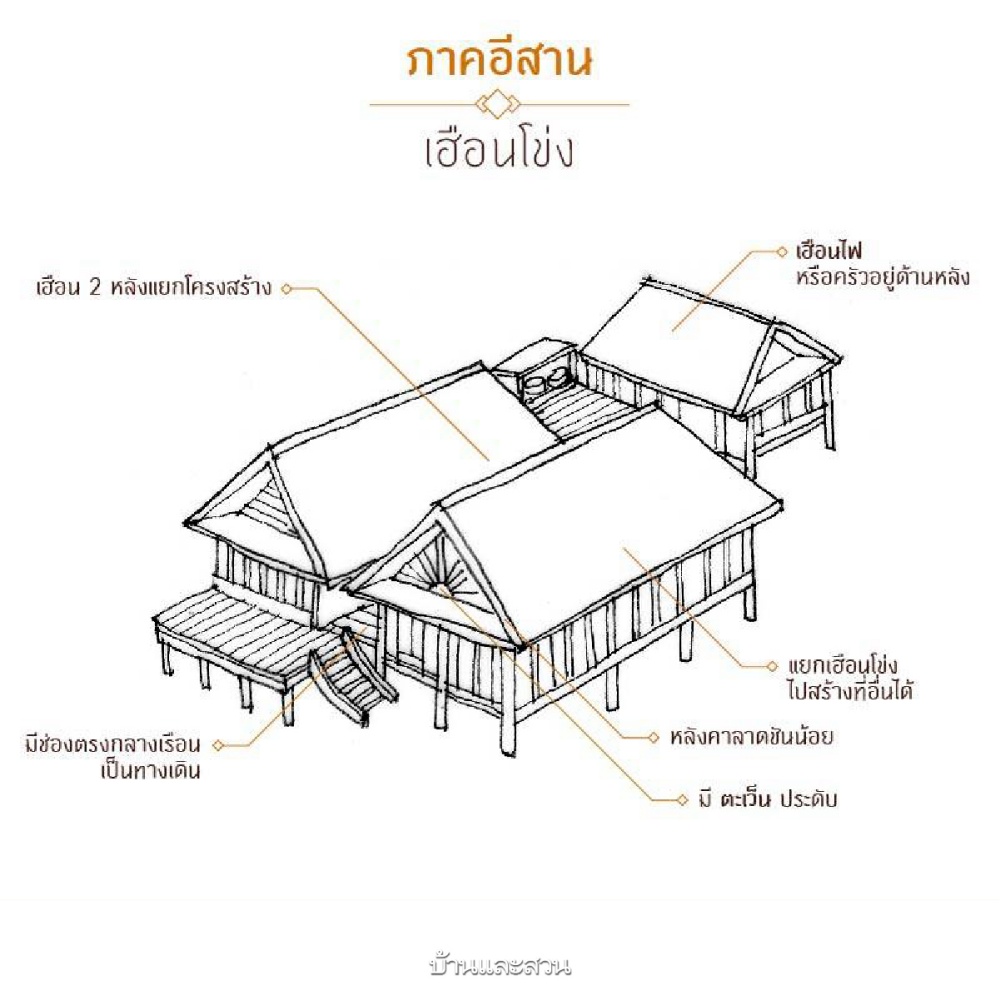
รู้จักเอกลักษณ์ บ้านไทยพื้นถิ่น 4 ภาค เหนือ/กลาง/อีสาน/ใต้ - บ้านและสวน
บ้านทรงไทย (ภาคเหนือ) - YouTube

บ้านทรงไทย (ภาคเหนือ) - YouTube
เรือนกาแล (พญาวงศ์) - พิพิธภัณฑ์เรือนโบราณล้านนา สำนักส่งเสริมศิลป

เรือนกาแล (พญาวงศ์) - พิพิธภัณฑ์เรือนโบราณล้านนา สำนักส่งเสริมศิลป ...
บ้านไทย รู้จักเอกลักษณ์ เรือนไทย 4 ภาค ภาคเหนือ ภาคกลาง อีสาน ใต้
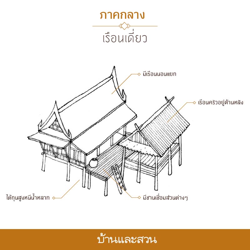
บ้านไทย รู้จักเอกลักษณ์ เรือนไทย 4 ภาค ภาคเหนือ ภาคกลาง อีสาน ใต้ ...
บ้านไทย รู้จักเอกลักษณ์ เรือนไทย 4 ภาค ภาคเหนือ ภาคกลาง อีสาน ใต้
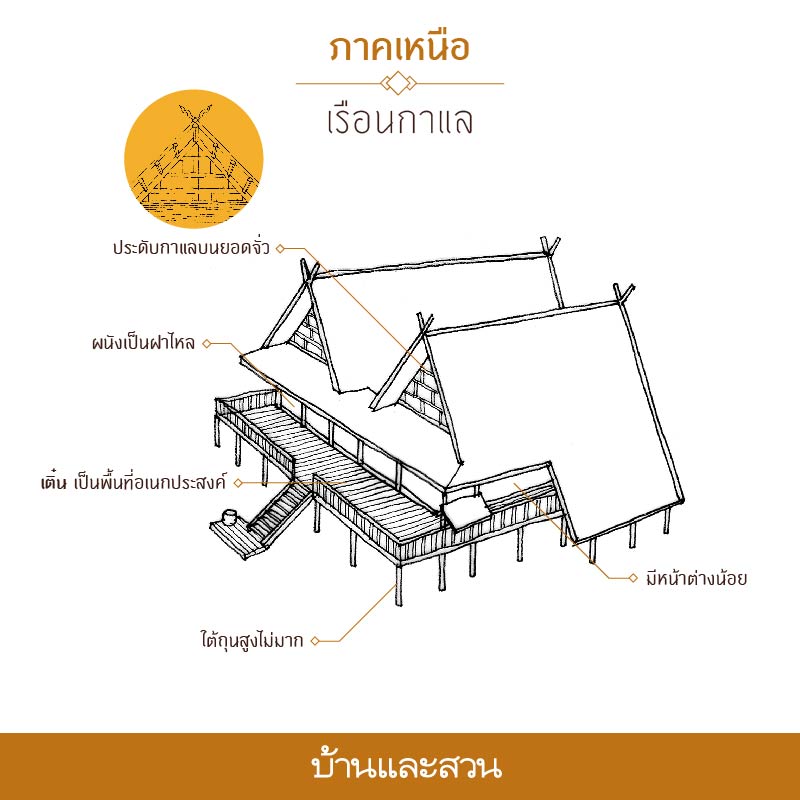
บ้านไทย รู้จักเอกลักษณ์ เรือนไทย 4 ภาค ภาคเหนือ ภาคกลาง อีสาน ใต้ ...